Responsive Websites and Accessibility Go Hand-in-hand
I have a hard time understanding why sites that promote accessibility do not have responsive websites. It is so hard reading articles when I am getting the desktop version of the site (1200px wide) on 320px wide device.
Focus on the good. permalink
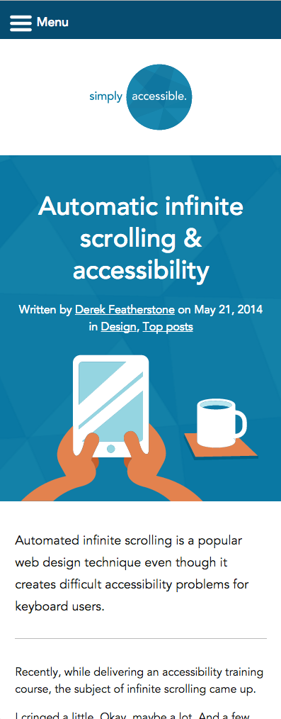
One of my favorite sites to visit is SimplyAccessible.com. The font size, color contrast for text and responsive nature of the site make it very easy to use on mobile. See. It looks great! But, what is even better, if your on a desktop and you zoom in 250% the site transforms into the mobile version. It’s 100% operable, but it also has the added benefit that it can work for someone that has low-vision. Video demo.
So, if you site is not responsive, you’re missing out on an opportunity to offer low-vision users a better desktop experience AND you missing the boat on mobile traffic. Mobile users have high expectations, if they see the desktop version on their mobile device they don’t even try to deal with it. They just abandon the site. See how going responsive changes that.
